Four chatbot widget patterns for websites and apps: from bubble to super app
Websites tend to embed chat in four patterns: a simple bubble, an inbox with history, a task-driven support bot, and a multi-tab hub.
This guide explains where each pattern fits, what it does well, and the least you need to configure to run it reliably.
(Acronyms: personally identifiable information (PII); service-level agreement (SLA).)
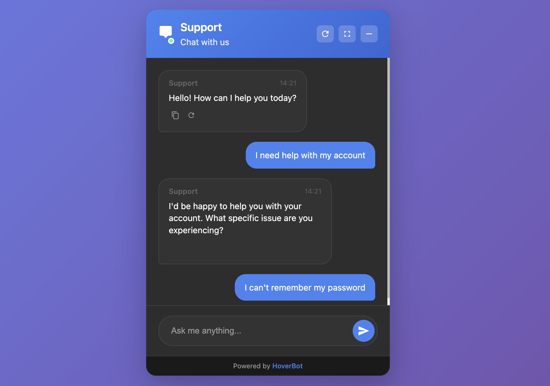
1. Simple chat bubble
What it is:
The simple chat bubble is a lightweight, single-thread assistant that opens when you click, answers your question, and then closes. It has no inbox or account linking and only limited memory.
Best for:
- Marketing pages and documentation landers
- Lead capture ("ask a question → leave email")
- Narrow, high-confidence FAQs
Strengths:
- Fast to ship; minimal UI surface
- Low maintenance and risk
- Clear focus on the current question
Trade-offs:
- No persistent history by default
- Limited multi-step tasks without tools/actions
- Harder to measure long-term outcomes
Minimum configuration:
- Greeting and scope: short, explicit welcome
- Knowledge base: 5–20 curated docs
- Guardrails: refusal policy, safe fallbacks, and topic blocks
- Intent capture: 3–5 quick-reply buttons
- Lead handoff: email form on low confidence or on request
- Analytics: impressions, opens, first response time, resolved vs escalated
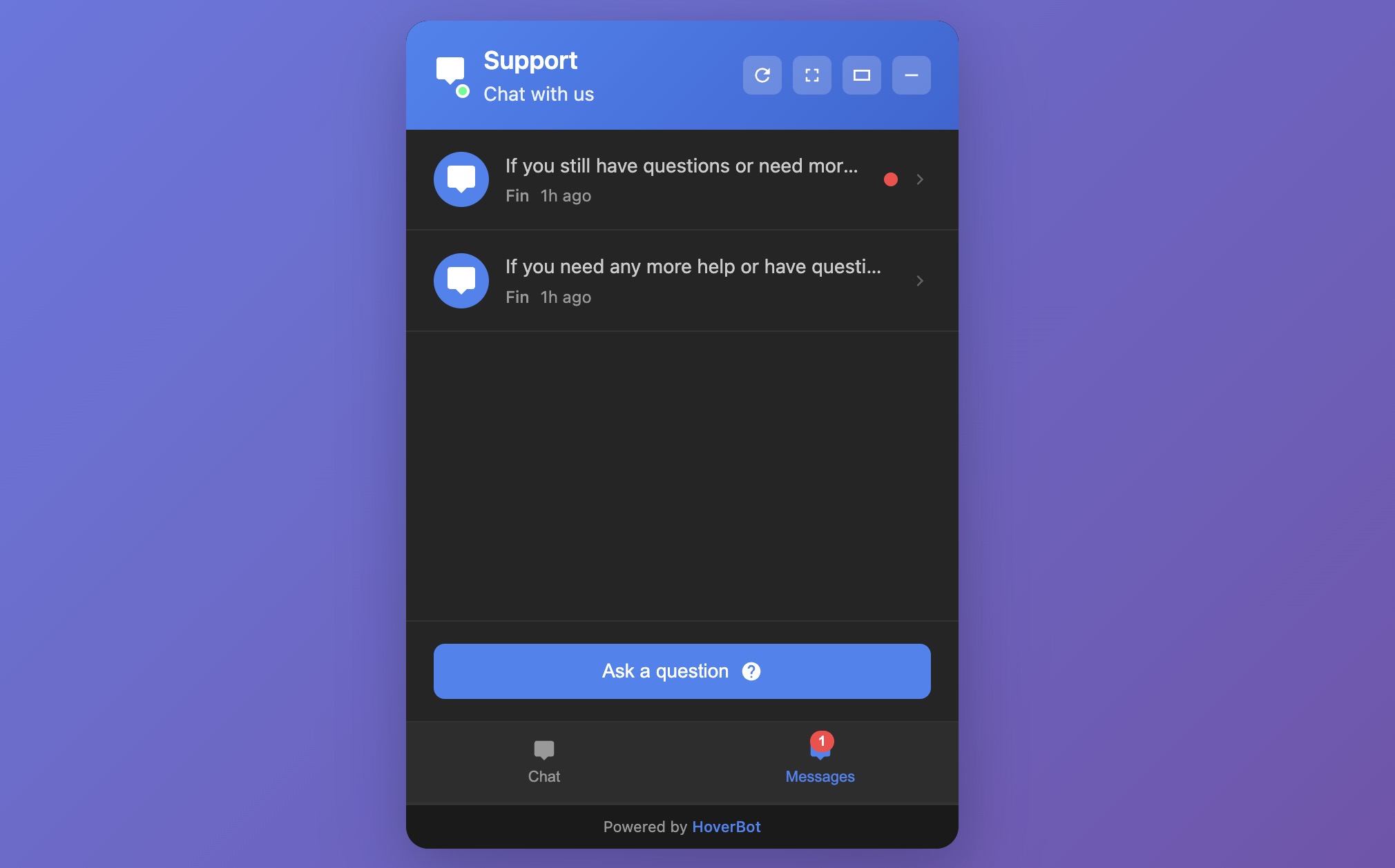
2. Messages list with history
What it is:
An inbox-style widget. Users can open past threads, resume conversations, and see bot or agent follow-ups.
Best for:
- SaaS apps and customer portals
- Education and healthcare portals where continuity matters
- Sales cycles that run over days or weeks
Strengths:
- Conversation memory within and across sessions
- Asynchronous support ("reply when ready")
- Clear UX for escalations and status updates
Trade-offs:
- Identity and storage decisions
- More compliance exposure (PII, retention, export)
- Operational overhead: SLAs, routing, backlog management
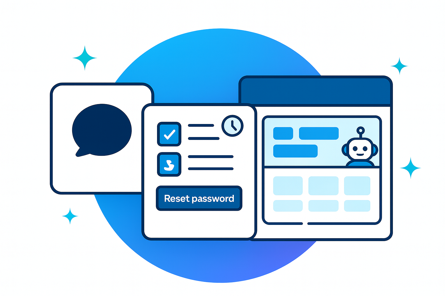
3. Product-support chatbot
What it is:
A support-focused widget built for tasks: look up orders, reset passwords, file tickets, schedule, check refund eligibility. Think "chat + tools."
Strengths:
- Measurable deflection and faster resolution
- Clear ROI when tools are reliable
- Structured analytics (top tasks, failure points)
Trade-offs:
- Integration work (CRM, ticketing, order and billing APIs)
- Precision demands: weak tools create loops and churn
- Ongoing maintenance of intents, prompts, and policies
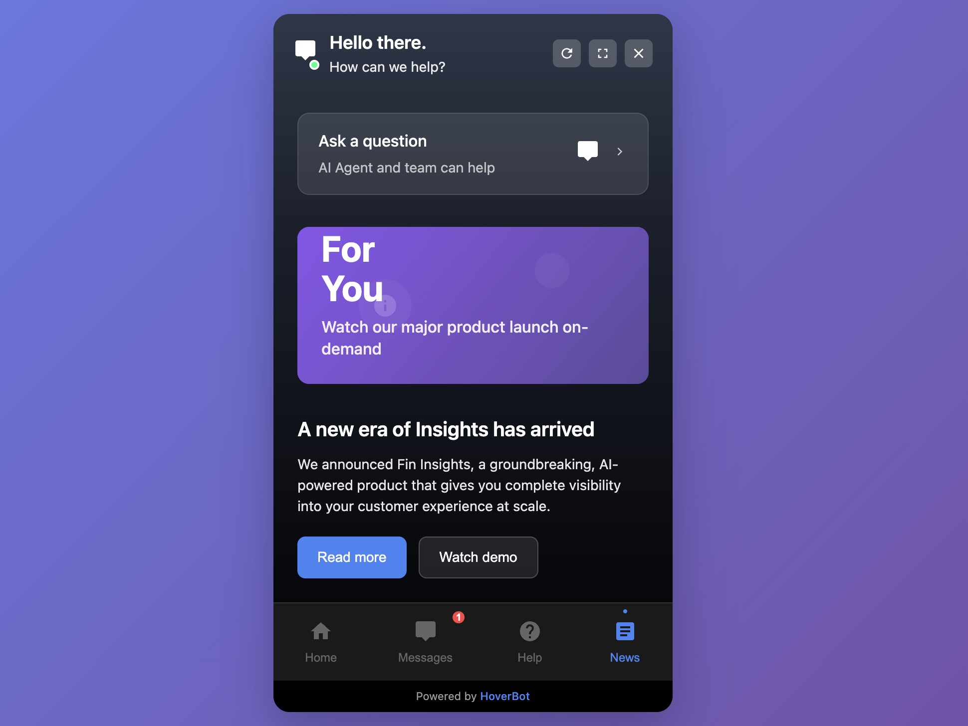
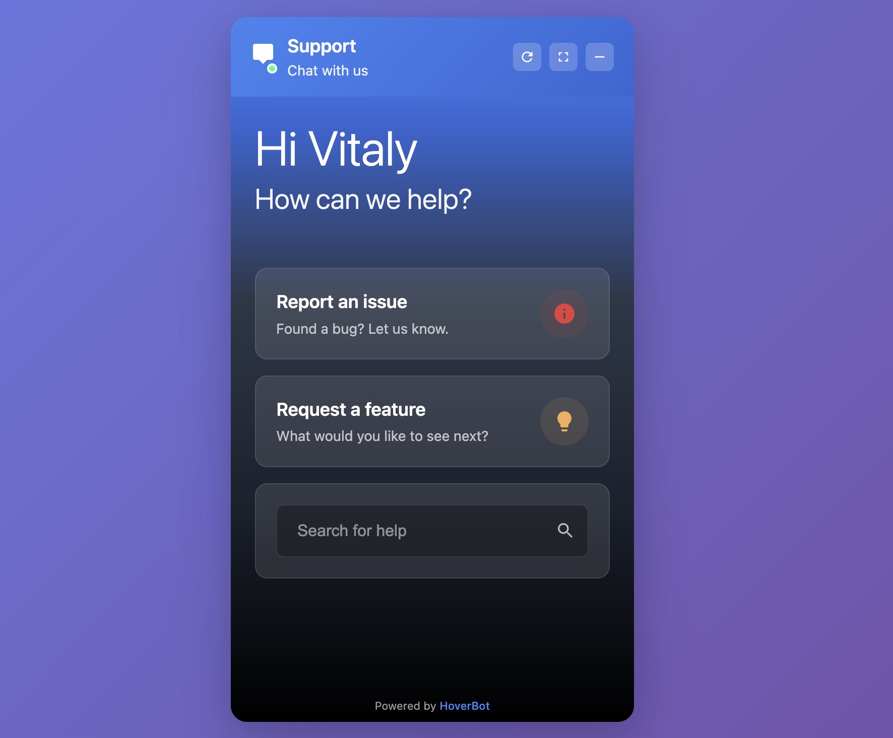
4. Multi-tab widget (the "super-app")
What it is:
A docked panel that bundles modules such as Home, Messages, Help, and News/Announcements; sometimes Tasks or Shortcuts.
Best for:
- Multi-feature products and communities
- Enterprise portals and intranets
- Sites that need to surface announcements, docs, chat, and actions in one place
Picking the right pattern
| Scenario | Choose | Why |
|---|---|---|
| Marketing site; FAQs and leads | Simple bubble | Fast, low risk, clear CTA to sales |
| Logged-in product; conversations span days | Messages with history | Continuity and async service |
| Measurable deflection on top 10 tasks | Product-support chatbot | Tooling and policies drive ROI |
| Multiple help surfaces: chat, docs, news | Multi-tab widget | One hub; consistent entry point |
| Heavily regulated flows (health/finance) | Messages with history or Product-support | Auditability, retention, policy enforcement |
Rule of thumb: Start with the simplest widget that delivers the outcome. Move up a level only when continuity, task depth, or surface area require it.
Bottom line
Pick the smallest widget that solves the user's job today. Add depth, such as history, tools, or multiple tabs, only when your product and users clearly need it. The gains come from clear scope, reliable tools, and disciplined measurement, not from the fanciest UI.
About the author
HoverBot TeamAI Product Engineering Team
Cross-functional team of AI engineers, product managers, and support operators building customer-facing chatbot systems in production environments. We ship weekly releases informed by production telemetry, closed-loop conversation reviews, and benchmark-driven evaluation cycles.
- Customer support automation and intelligent routing systems
- RAG pipeline design and guardrails for regulated workflows
- Operational analytics and closed-loop quality improvement
- Multilingual NLP and entity-level PII masking pipelines
- Production deployments across e-commerce, real estate, and SaaS verticals
Share this article
Related Articles
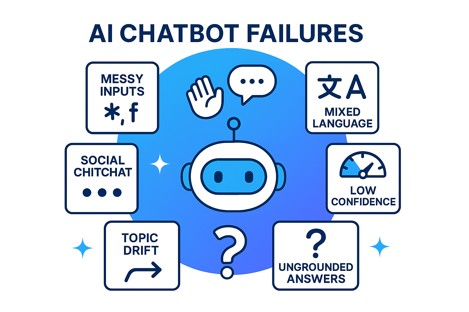
Why Building a Customer Facing Chatbot Is Hard (and How to Fix It)
The hardest part is not the model, it is the human layer. Learn how to detect social intent, run guardrails, ground answers with retrieval, and use confidence gates to build chatbots that sound human, not robotic.
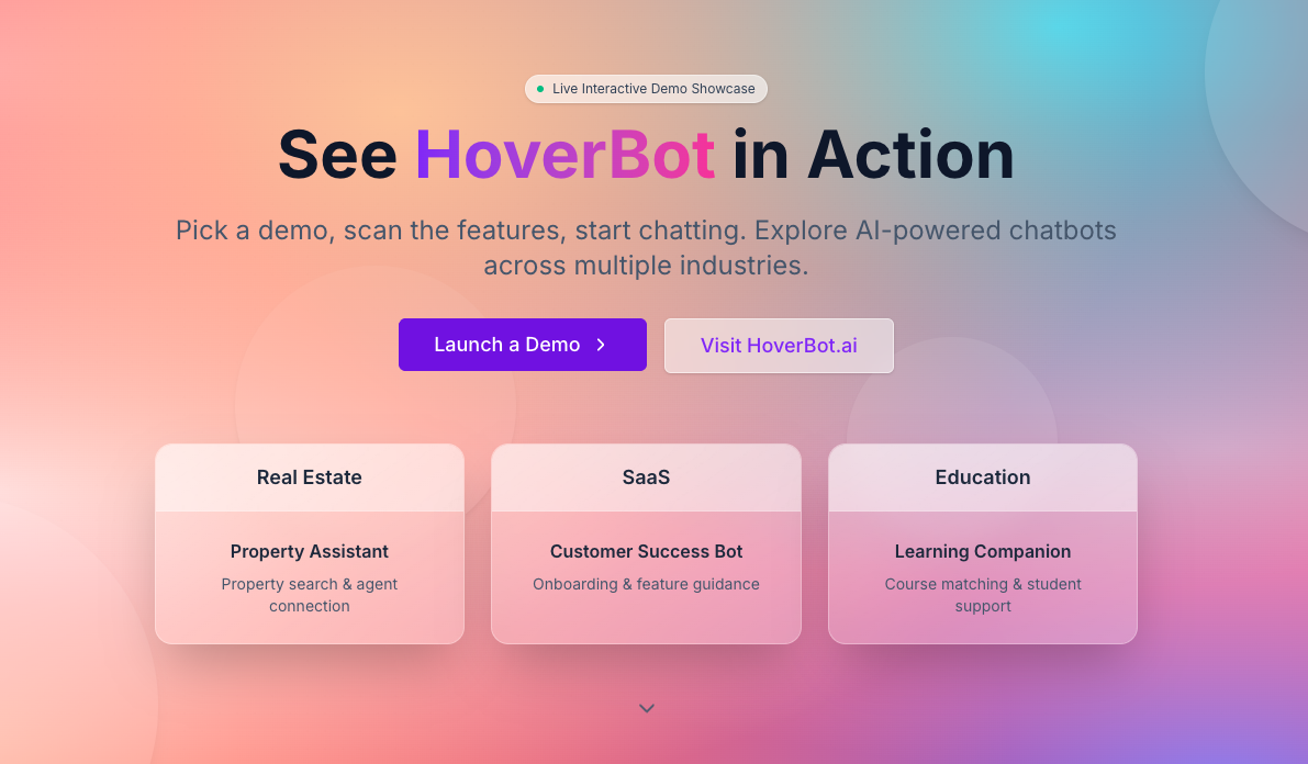
HoverBot launches public demo portal with industry showcases
HoverBot has launched a public demo portal that lets buyers, product teams and developers test its website chat widget in realistic scenarios. The portal includes a central gallery and two industry demos showcasing different use cases.